Design
EdTech - Online Learning Platform
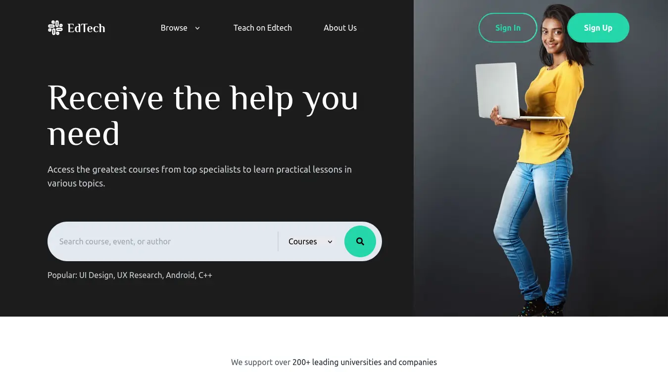
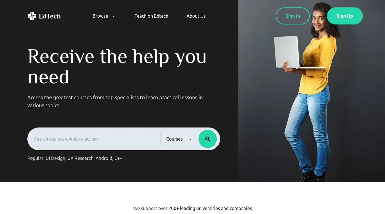
EdTech was my deep-dive into UI/UX design for educational platforms. I designed and built the entire frontend with Vite and React — no backend, just a polished interface with course browsing, category filtering, a learning dashboard, and progress tracking UI. The goal was to prove I could design a cohesive experience from wireframe to implementation, not just code someone else's mockup.
Project Goals
- Design a course browsing experience that feels intuitive, not like a spreadsheet.
- Build a dashboard layout that gives learners a clear sense of progress.
- Practice component-based architecture with reusable UI primitives.
- Ship a polished, accessible design that works on every screen size.
My Process
Started with wireframes in Figma — mapped out the user flow from landing page to course detail to dashboard. Then built the component library in React before assembling the pages. Used Sass for design tokens (colors, spacing, typography) and Tailwind for layout. Every component was built mobile-first.
Challenges & Solutions
Challenge:
Making the course grid feel dynamic without a real backend — had to mock data that felt realistic enough to design around.
Solution:
Created a realistic mock dataset with varied course lengths, difficulty levels, and progress states to stress-test the layout.
Challenge:
Balancing visual density with readability on the dashboard — too many cards felt overwhelming, too few felt empty.
Solution:
Used a responsive card grid with collapsible sections and progressive disclosure — show summary first, details on interaction.
Challenge:
Ensuring color contrast and focus states met WCAG AA standards across the entire flow.
Solution:
Ran every screen through a contrast checker and added visible focus rings on all interactive elements.
Key Learnings
- Designing without a backend forces you to think harder about information architecture — you can't just "load more" your way out of bad UX.
- Component libraries are only useful if the tokens (colors, spacing, typography) are defined first — building components without tokens leads to inconsistency.
- Accessibility isn't an afterthought — baking it in from the start is 10x easier than retrofitting.
Gallery