Development
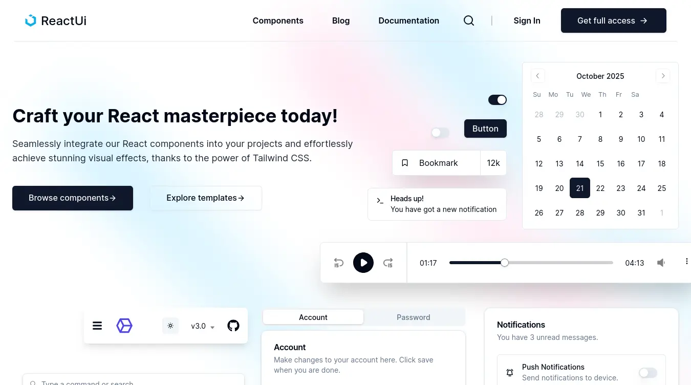
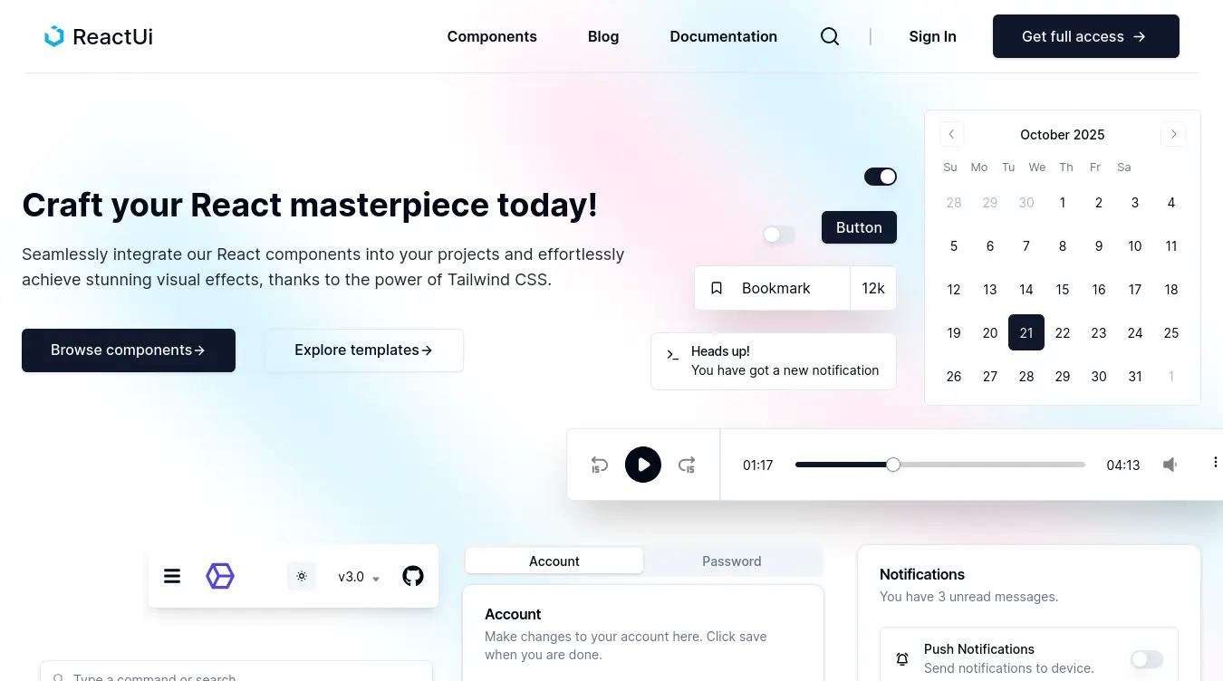
ReactUI - UI Components
ReactUI started because I kept rebuilding the same buttons, modals, and form fields across projects. I wanted a library that was accessible by default (thanks to Radix UI), customizable with Tailwind, and had documentation that actually showed you how to use each component. Built 20+ components covering application UI, marketing elements, and e-commerce patterns, each with live previews and code examples.
Project Goals
- Build components that are accessible out of the box — no extra work needed.
- Make every component customizable through Tailwind classes, not config objects.
- Create documentation that shows live examples with copy-paste code.
- Keep the API surface small — each component should do one thing well.
My Process
Started with Radix UI as the foundation for accessibility, then wrapped each primitive in a styled component using Tailwind. Built a documentation site with live previews using a custom MDX setup. Each component went through a cycle: build, test with screen readers, document, then ship.
Challenges & Solutions
Challenge:
Radix UI's compound component pattern needed a wrapper API that felt familiar to developers used to Material UI.
Solution:
Created thin wrapper components that expose a simplified prop API while delegating accessibility to Radix underneath.
Challenge:
Ensuring every component passed axe accessibility checks without adding excessive ARIA attributes.
Solution:
Automated accessibility testing with axe-core in the CI pipeline — any component that fails can't be merged.
Challenge:
Writing documentation that's useful — most component library docs are either too minimal or overwhelming.
Solution:
Built a live playground for each component where users can toggle props and see the result immediately.
Key Learnings
- Accessibility is mostly free when you build on Radix UI — the hard work is already done in the primitives.
- Component APIs should be opinionated at first, then extensible — not the other way around.
- Documentation is a product, not an afterthought — invest in it like you invest in the code.
Gallery